As a seasoned producer of charts, you have probably wondered why Microsoft has not included certain type of charts that have previously only been available via third-party add-on programs. Microsoft has heard your calls and added some new and exciting charts to the Office 2016 charting engine. These charts type are not just available in Excel; you can find these new chart type in all of the Microsoft Office 2016 product line.
The new types of charts we will highlight in this article are:
- Waterfall
- Histogram
- Pareto
- Box & Whisker
- Treemap
- Sunburst
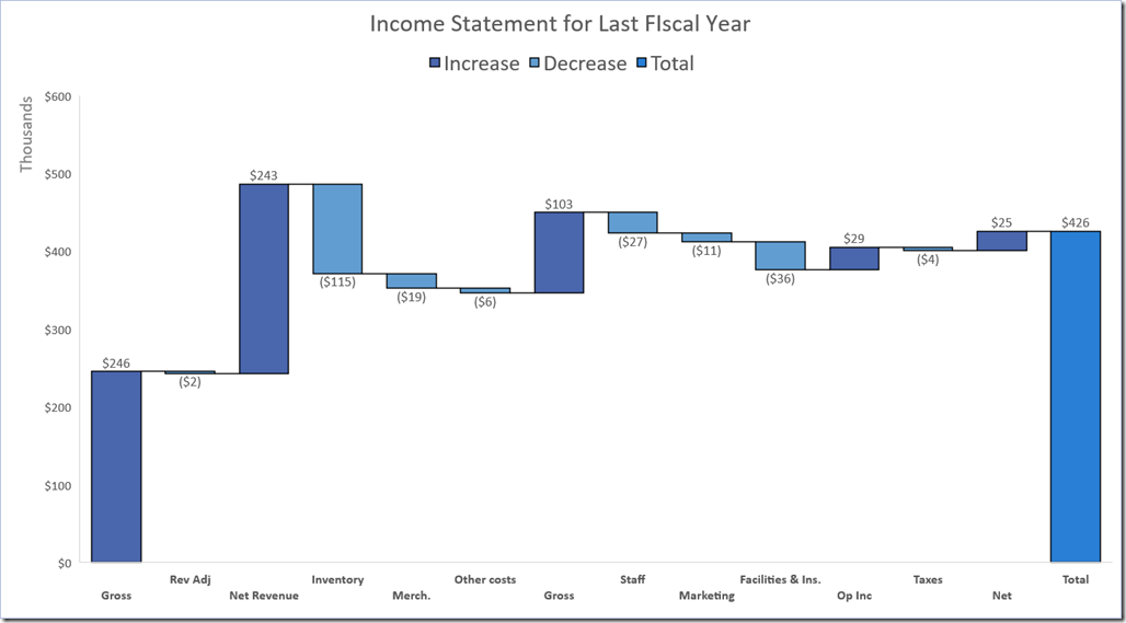
Waterfall – Visualizing Budget Information
A Waterfall Chart allows the user to start with an initial value (a traditional column), and then graphically introduce positive and negative change relative to the initial value (represented as floating columns.) The Waterfall Chart may also show the point at which the transactions end and represent the end-point as a traditional column, just like the initial value. This method of displaying change relative to the start is an excellent way to highlight categorical change. For those of you who have ever tried to make a Waterfall Chart in previous versions of Excel, you know the frustration of building an “invisible chart” to support the floating columns. You’ll be happy to know that those days can be set to pasture.
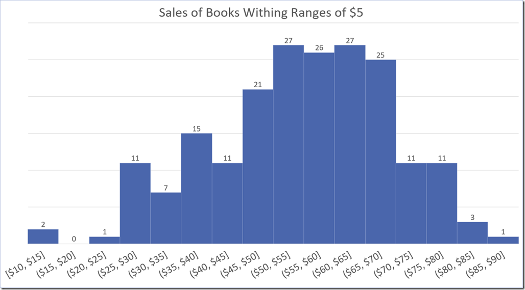
Histogram – Clustering Data by Range
Plotting out every known data point in a data set can result in a very claustrophobic and difficult to read chart. Having the ability to group data points within a defined range can simplify a chart and grease the analytical skids . The Histogram Chart is similar to a traditional column chart; but where a traditional column chart plots categorical variables (i.e. North, South, East, West), the Histogram Chart represents a continuous flow of data (i.e. 1 through 1,000.) In the histogram, ranges (or “bins”) can be defined to group all data points that fall within the defined bin range.
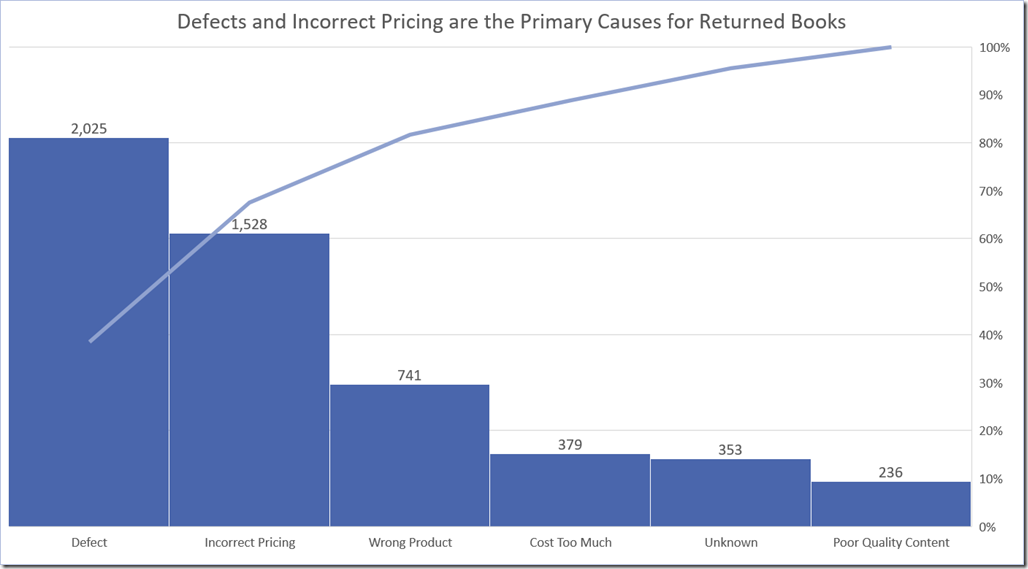
Pareto – Discovering the Heavy Hitters
“What’s a Pareto Chart”, you ask? Think of a Pareto Chart as a traditional combination chart where a column chart represents data along the primary Y-axis, and a line chart represent a percentage along the secondary Y-axis. This type of chart is easily created with a standard combination chart, but the catch is that the data and the percentages must be contained within the original data source. A Pareto Chart only needs the data; the percentages and the line chart for the secondary Y-axis are inferred from the original data. Pareto Charts are typically sorted in descending order by category so that the line chart represent a running total of percentages as each category of displayed left to right along the X-axis.
Box & Whisker – The Marriage of Distribution and Statistics
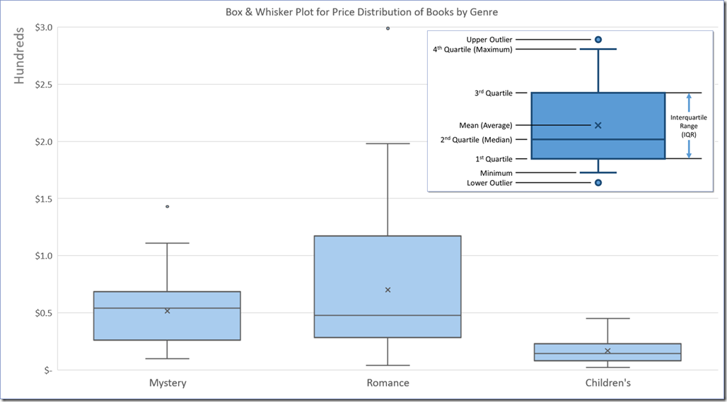
Every fan of statistical functions will appreciate the simplicity of the Box & Whisker Chart. This little chart pack a whole lot of information in a small space… and with very little effort. Box plots depict numerical data through their quartiles, also known as an interquartile range. Outliers can also be displayed as individual data points.
For a statistician, using functions like Min, Max, Average (Mean), Median, and Quartile are like a trip to the Magic Kingdom. The only downside to the Magic Kingdom is the drive there. Box & Whisker allows you to graphically represent all of the afore mentioned statistics without writing a single formula. All that is needed is the raw data, the chart will generate all of the answers.
Treemap – Hierarchical Comparisons in a Single Chart
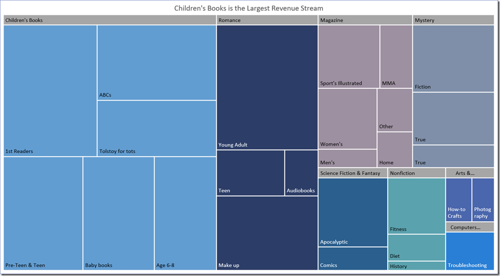
A Treemap is an ideal choice for comparing a category against other categories, as well as comparing sub-categories against one another. Treemaps display related data as a series of nested rectangles. Each initial rectangle represents a category and sized relative to one another. Within each single rectangle (category) are smaller rectangles that represent the sub-categories. Treemaps are one of the best ways to display large amounts of relativistic information in a small amount of space.
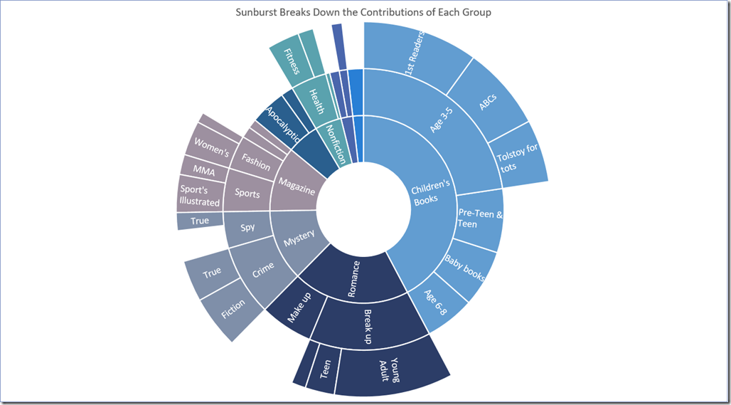
Sunburst – Treemap for Those Who Love Pie Charts
A Sunburst Chart is similar to a Treemap in the sense that it displays a hierarchy of information, but instead of nested rectangles, the relationships are represented as outwardly growing concentric rings. The inner-most ring is the primary category while each successive ring represents a sub-category. For those of us who have difficulty comparing angles against one another (especially when rotated at different angles), the Treemap may be a friendlier alternative… but the Treemap can’t hold a candle to the Sunburst in the “Pretty Department”.
